
As an avid shopper, I’ve spent my fair share of time perusing e-commerce websites in ardent pursuit of the perfect pair of shoes or the moisturizer to cure my dry skin (Minnesotans, you feel me?). I’ve spent time on websites that are so easy and intuitive you can almost hear the dollars exit my bank account. I’ve also, however, trudged through sites that made me jump ship from sheer frustration – even when I was ready to buy! Whether in a physical store or an online store, the way products are organized affects the entire shopping experience. Your customers need to be able to find what they’re looking for, and you have the power to make that happen!
Wondering how the top online retailers are doing when it comes to providing a great e-commerce experience? Download our newly released benchmark study!
After the homepage, visitors go to one of two primary places to shop around: the internal search bar or the product listing pages. We shared tips for optimizing your internal site search in another post, but today let’s talk about product listing pages.
As the name entails, a product listing page lists all the products within a product category. It gives visitors a high-level view of their options within a product category (say, pants) where they can compare options and decide whether to give something a closer look. A well-designed product listing page is to your online store as a properly merchandised department is to a brick-and-mortar store.
Are your product listing pages doing their job? Make sure you have these four best practices in place.
Save the Best for First: Sort Products by Bestsellers by Default
We might hate to admit it, but social influence has a powerful hold on our decision-making. Most of us like to do what’s popular or what’s been proven effective. Setting the default sort function on a product listing page to show bestsellers or top sellers at the top of the page subtly puts shoppers at ease. By first showing products that other people love, you’re letting your shopper know you have their best interest in mind.
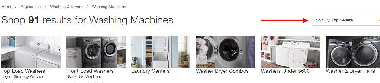
Here’s an example from Home Depot, giving their bestselling washing machines the best real estate on the product listing page by default. When the item costs hundreds of dollars and should last decades, this is so, so important.
Other widely-used sorting options include:
- Highest Rating (you need a robust review program for this)
- Relevance
- Featured *
- Best Match
- Newest *
- Name
- Price: Low to High *
- Price: High to Low *
None of these options are inherently bad, but you can probably see the downfall of setting a few of them as the default sorting option (particularly those with a *). Price may pose a hurdle for shoppers if set high to low; alternately, if set low to high, your average order value might suffer. Showing the newest products first can be effective for clothing brands, for example, but you’ll want to carefully consider whether you want to show new products before you show proven sellers. Sorting by relevance can be highly subjective and might send a shopper in the wrong direction. And if I’m looking for a great pair of jeans, I don’t want to see what’s “featured” first; I know quite well the store wants to sell me the most expensive pair!
So, while other options are good to have, we’ve seen setting the default sort option to best or top sellers to be most effective.
Equip Shoppers with User-Friendly Filtering Options
The more products your site offers, the more important your filtering options are. In the absence of human sales associates, product listing page filters play the pivotal role of helping a shopper sift through an array of products to find what they need.
Relevant filtering options will differ depending on the number and nature of the products you sell. Make sure the functionality works well and that sorting options are robust enough to filter down to a small, relevant selection of products. Successful e-commerce sites allow their customers to filter 4,000 products down to four relevant choices based on individual inputs.
Product listing page filtering should be:
- Free of glitches
- Intuitive and user-friendly
- Appropriate for the products on the page (e.g. include options like size, brand, and heel height for women’s shoes, but use options like make and model for car shopping)
- Able to narrow down from a very large number of options to a few options
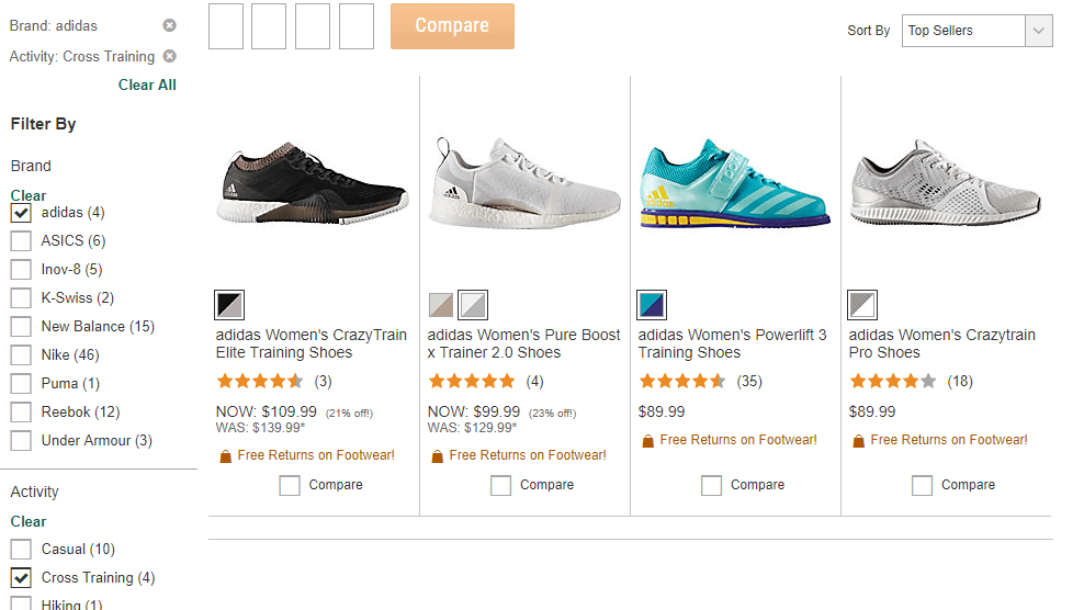
Here’s an example from Dick’s Sporting Goods, where we could filter 532 women’s athletic shoes options down to four by selecting a brand and activity type – two very relevant filtering options for sneakers!
Pro Tip: The data you can gather from filtering selections directly reflects consumer demand and the subsequent conversion rate is a scorecard of how effectively you’re meeting demand. Learn from this valuable data!
Show Me the Money: Display Was/Now Pricing
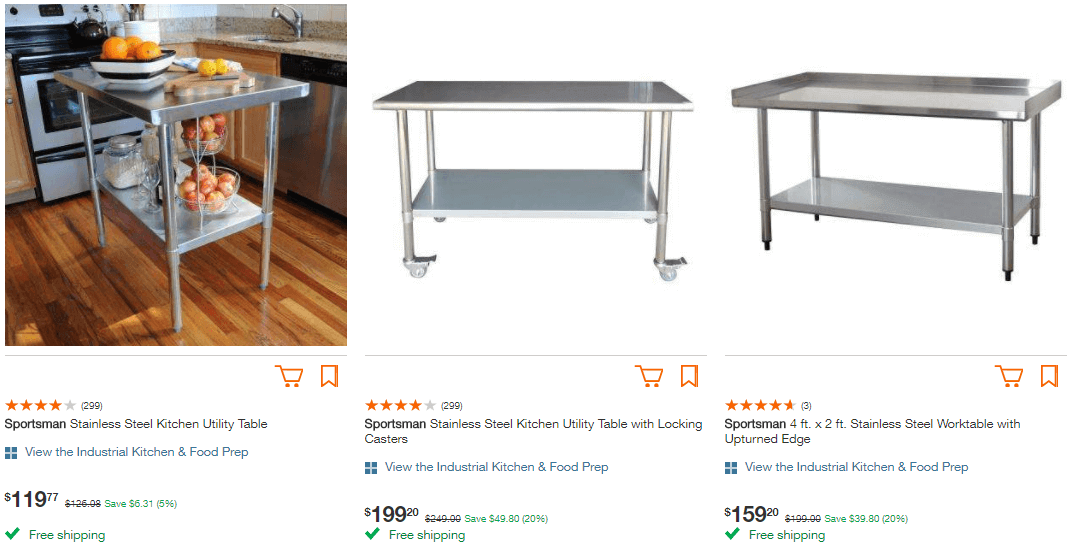
“And it’s on SALE!” Famous last words of a shopaholic… or so I’ve heard. Whether you’re running a promotion or a product is marked down, it is downright insane to not show the regular price and the sale price of an item on your product listing page (assuming you have the functionality to do so). For someone who is on the fence, seeing that slashed price could seal the deal – or at least cause them to click on the product detail page.
Some retailers simply show the regular price and the sale price next to each other. Others might go the extra mile to show the potential savings, too.
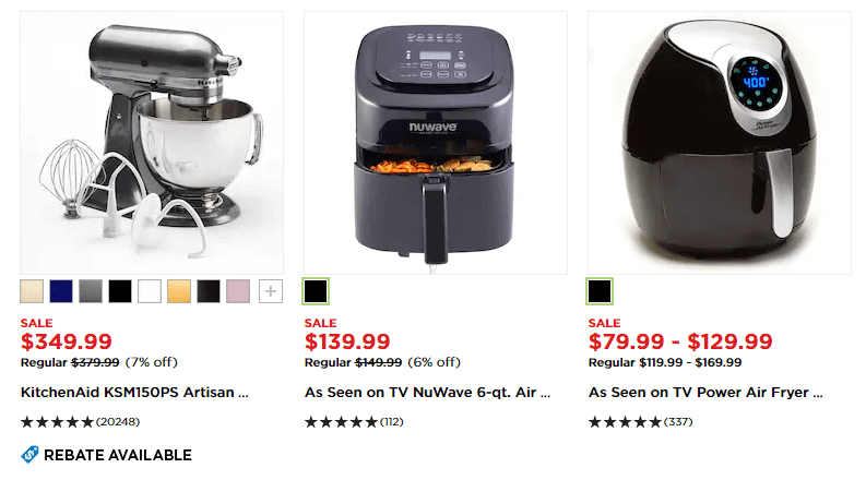
Either way, the idea is to save your customer the brain power and make them not have to think about it. Because who actually feels like doing math while shopping? Hard pass.
Help Me Decide: Offer Side-by-Side Comparison Functionality
Making decisions is hard. And if there is one thing we have in spades in 2018, it’s options. A fantastic way to replicate an in-store experience with a human sales associate is to offer side-by-side comparison functionality from the product listing page.
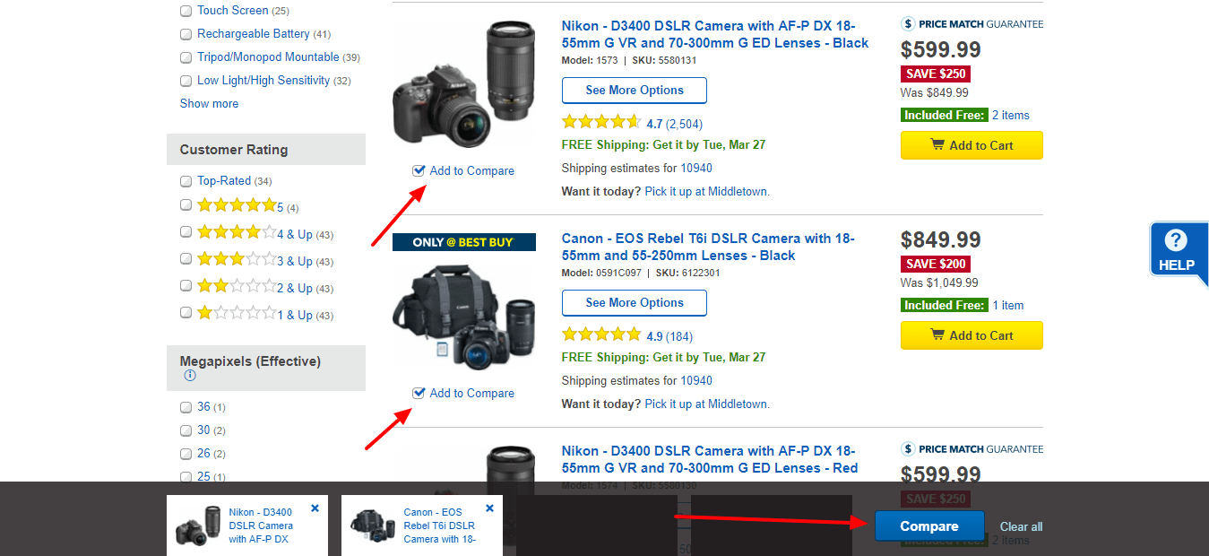
Many e-commerce platforms offer this functionality and we can only assume the rest will follow suit. Because why not? Providing your online customers with the right tools to evaluate products next to each other empowers them to click confidently all the way to the order confirmation page. So, if you want to improve online customer experience (and close more sales), a side-by-side comparison feature is a must.
As an e-commerce website, what’s the best way to stand apart from your competitors online? Help your customers better than the next guy. Sorting products by bestsellers, providing user-friendly filtering options, showing was/now pricing, and offering side-by-side comparisons are four ways to do exactly that with your product listing pages. Make no mistake: creating a fantastic online experience for your website visitors will be the difference between dollars in your pocket or your competitor’s.
Interested to know if the top online retailers’ websites are following these and other e-commerce best practices? Download our free Benchmark Study of 50 of the NRF’s Top Retailers!
Looking to take your online retail business to the next level? Take a look at our Ecommerce capabilities.