With research at hand and an interest in e-commerce, I decided to dive-in and define what makes an e-commerce site successful in 2018. The results were intriguing.
1. Ever-Present Search Bars
After doing an audit of 50 companies – I realized this feature is not very common. However, the reasoning for why that should change is solid. The ability to search on an e-commerce site is one of the most vital aspects to success. Visitors should not have to scroll to the top of the page to find a new product. A global search bar solves this problem.
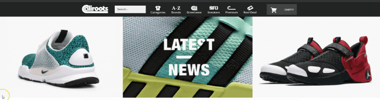
As you can see in these images, I have scrolled halfway down the page and the search bar remains prominent.
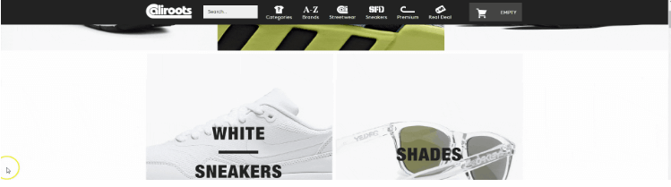
2. Display Products in Rows
Marketing professor at Wharton School and Director of the Jay. H. Baker Retailing Center, Barbara E. Kahn said, “The notion is you will take one product when goods are stacked vertically and more than one when they are stacked horizontally. Retailers have figured this out.” (Link to Study).
This idea has been titled as the row practice (instead of columns being vertical).
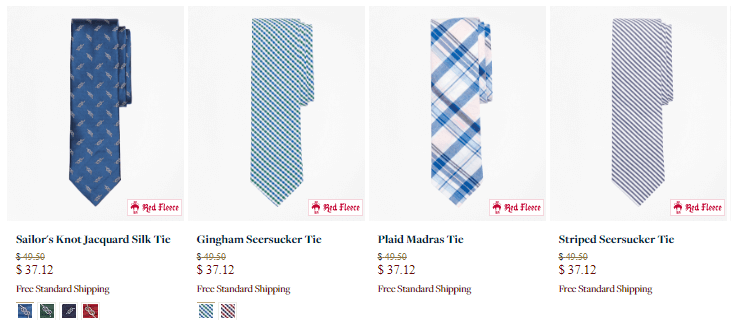
Many clothing items usually are placed vertically. However, with a few tips from the pros, this might soon change. This is an example of horizontal placement.
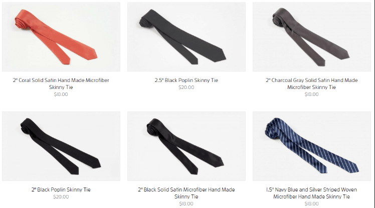
Below is a sample of vertical images. This is the opposite of what professor Barbara E. Kahn said works best.
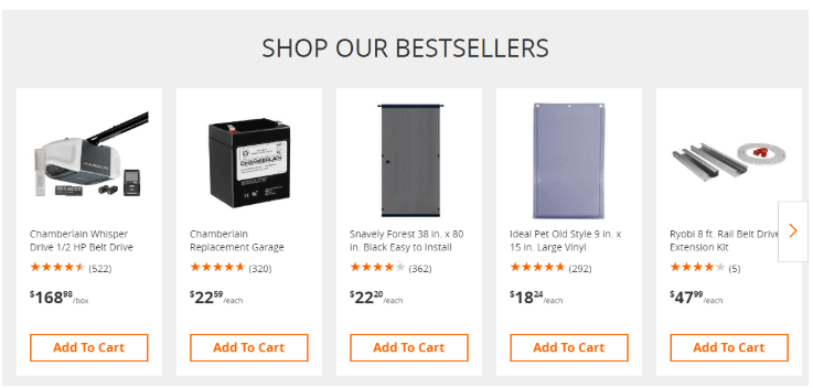
3. Best Sellers Sections
Not only is it recommended that you set your default filter to “Best Sellers,” but also have a dedicated Best Sellers section. As little as we like to admit, we often find interest in what is popular. Usually these sections are found under product detail pages to remind customers of what others have bought. Home Depot is testing this idea:
4. Compelling Product Copy
Sometimes people think less is more, but in the case of product display pages – this is not always true. The obvious factors like clear images, multiple views, and zoom features are always important when it comes to closing a sale. A very important aspect to these pages is often forgotten – product copy.
Product copy is common on usable items like grills, televisions, or curling irons. However, sometimes the most lacking category is clothing. The customer can see the shirt, so we don’t need to elaborate, right? Wrong – it is always helpful to provide fun and enticing copy that is written in a benefit driven matter. Not all product copy can be “fun,” but it can be informative. Give your customers another reason to love your product.
This compelling copy provides a visual depiction of the product working. By leaving an image in your customer’s mind, you can increase your chance of sale and highlight the benefits of buying.
5. Simple Design
Simplicity in a website header is an easy way to catch the eye of your customer. Full-width images with minimal text often indicate simplistic design. Simplicity is eye-catching and a busy site will cause distraction and make it hard to focus on the main call-to-action.
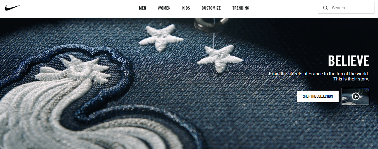
The example above shows a full-width website header with minimal text. This design is simple, yet eye catching.
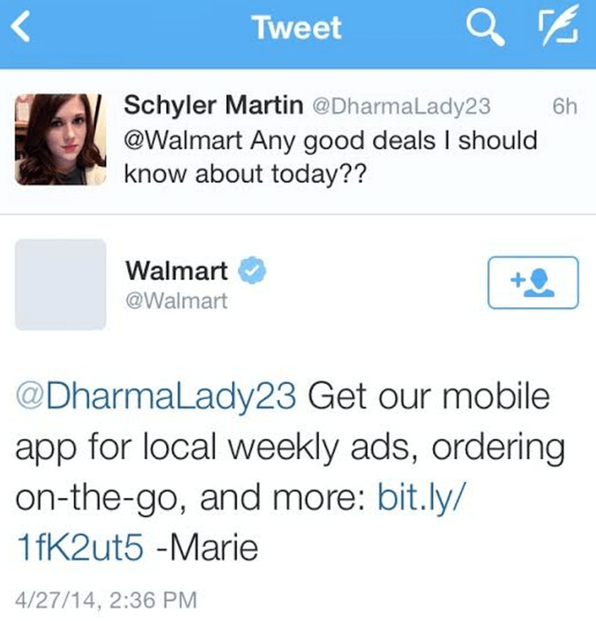
6. Social Trends
Social media is the easiest platform to reach a high volume of customers. When you actively respond to customers, it makes them feel like you care and provides an outlet for potential customers to see your name. This engagement creates a relationship between you and your customers. Below is an example of a helpful reply.
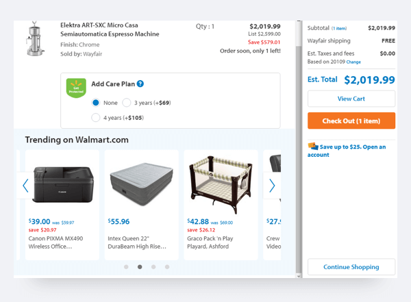
7. Principle of Scarcity
Setting an availability bar puts a timeframe on the customer. If they love the product, they will not want to risk it selling out. Sometimes this can happen in forms of “Only one left” or “Order soon, only a few left.” Below is an example of this type of selling.
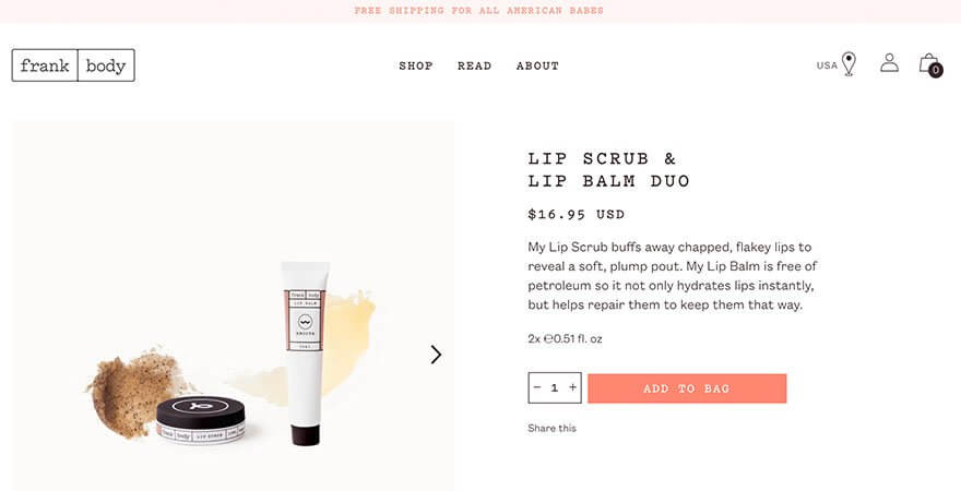
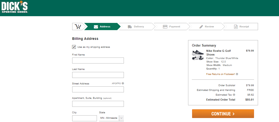
8. Single Page Checkout
One of the main reasons why carts are abandoned online is due to long checkouts (Baymard Institute). An example of a long layout is the breadcrumb checkout. Below is a depiction of this long checkout style.
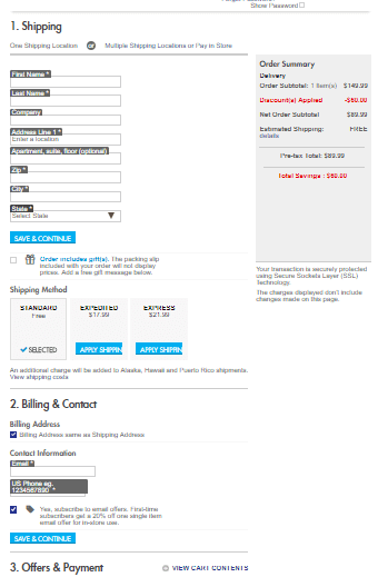
This layout is complicated due to the multiple screens it requires. In order to hit submit and checkout, you must click continue four times. This is four times too many. However, you can easily avoid this with a single page checkout. A single page checkout is a layout that asks all questions in one slide and displays the submit button at the bottom of the page. By making the checkout process quick and easy, more conversions will come your way. Below is an example of a single page checkout.
If you are in the retail market, you must ensure your shopping experience is staying up-to-date in the competitive market. Follow the tips above to clean up your site and wow your customers. Want to make sure your e-commerce site stacks up against leading retailers?
Read our 2018 E-Commerce Retail Benchmark Study here.
Looking to take your online retail business to the next level? Take a look at our Ecommerce capabilities.